4. How did you use new media technologies in the construction and research, planning and evaluation stages?
New and different technologies were used throughout my entire project to allow me to make full use of the capabilities on my blog.
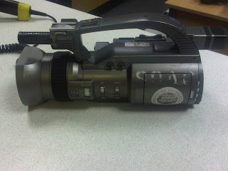
When filming our music video we could not use the Sony AE1 as they were not available for our time of filming. Instead we used this JVC 300 Camcorder, which we later got told actually produced a poorer quality picture, but we found that the quality of our final film was great still.
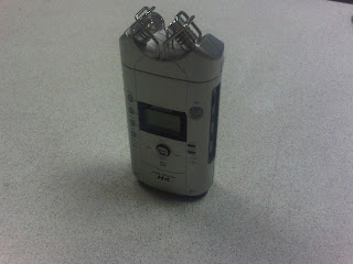
This is a Zoom Recorder. I used one of these when recording my voice over commentary in my evaluation. I recorded my speech on this, transferred it to a Mac, and then placed it over my music video using iMovie. This was very effective and easy to use.
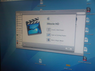
This is iMovie HD, the program that we used to edit our film and also to do my voice over commentary. This was a very effective program and I would most certainly use it again. I learnt how to cut up, edit, add audio, add effects and switch scenes around with this program. I now feel i understand the basic techniques when editing a film.
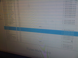
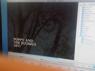
iTunes was used to transfer/convert and play audio, such as the song UFO for our music video and also for my commentary audio. The purchase of UFO was also off iTunes.
This here is the aged film effect on iMovie; I wanted to demonstrate that I could use the editing skills on iMovie effectively.
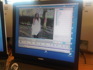
Throughout the entire film we altered the brightness, contrast and saturation. This here is the bars that we altered to gain these different effects. This was essential in gaining the correct lighting to the camera shots.
Again another editing technique; this one here is the saturation that was placed on the shots to decrease the colour strength. This worked effectively as we could gain a less vivid image.
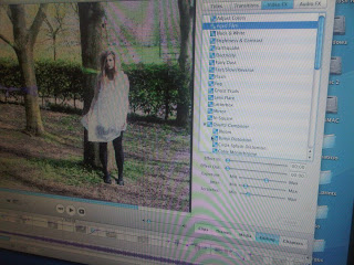
At the beginning and the end of the video, fade in and out were used. We found this very effective as it closed and opened the scenes; it flowed well because of this. We also added titles to the first shot of the video; music video titling was used as this conforms to the idea of a typical music video, following real media conventions.
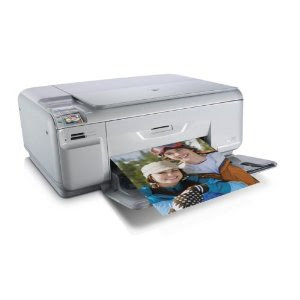
A Hewlett Pakard HP C4580 Printer/Scanner was used to scan images and paper work through to the computer such as magazine pages, questionnaires and hand drawn layouts. This was an easy piece of equipment to use and allowed my blog to appear more varied as I could use both hand drawn and computerised documents.
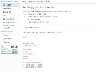
Hotmail was used as an email device to contact people, such as the management of Poppy and the Jezebels. I found this more effective and professional than telephoning; I can now also contact this management to send relevent documents such as the product we used their song for. i.e the music video link. This was also an effective tool to recieve documents off other members of my group, such as a group call sheet or script.
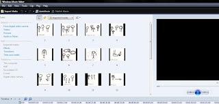
I used Windows Movie Maker when creating my animated storyboard; this worked effectively in my opinion, though I did have some trouble applying a song to the movie. On the other hand the rest of the programme was incredibly easy and effecient to use, as the shots are placed in order for you, you just re-arrange and place in time with the audio.
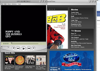
During the final stages of my project, when compressing the final music video and other videos such as the commentary of mine, Quicktime was the best tool available. It was easy to use, and you can also play your movies off the programme.
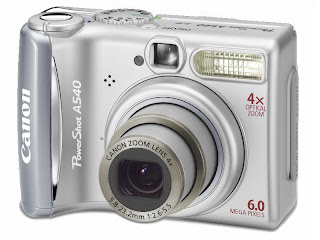
Small yet powerful, I used my Canon Powershot A540 to record, video and take photos throughout my project. I recorded myself discussing the final music video with it; this transferred to the computer easily with a usb cable. I also took photos with this camera throughout the project.
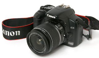
For the more professional and important photos, my Canon 450D was used. I used this camera when taking photos of Jo, our main character in the studio (in another subject), and also of the rabbit mask in my garden for our test shoots and final products. This has proved a very good piece of equipment; from altering the settings such as the aperture, shutter speed, ISO and white balance, I was able to gain some great shots.
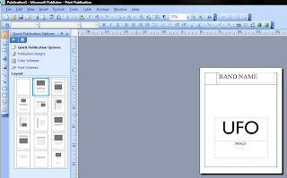
Microsoft Publisher was used briefly when designing some of my computerised layouts, such as some poster layouts. There were simple tools on the programme, such as text boxes and rectangle shapes that can quickly and effeciently create a rough layout.
From day one of the project, Adobe Photoshop CS3 has been used to crop, edit and enhance photos. This was especially effective when digitally manipulating the printed products, such as the digi pak and poster. I could alter the colours, add text, darken, lighten, clone pieces of the images and also move them around. This was an essential programme to gain the products which we have. I am glad that I have CS3 at home as well as in college as I could edit photos whilst at home aswell as in college.
Friday, 30 April 2010
Evaluation question 4
Microsoft Excel was simply used to create tables and graphs. When conducting my first questionnaire I inserted my results and produced different graphs to present my results more formally and visually easier. I also created filed and ordered results.
When filming our music video, a tripod was used to keep the camera steady and also to allow it to pan more smoothly. Unfortunately the tripod was not used to its great potential as a lot of our music video was hand held recorded to gain different angles etc. I would most definately use the tripid more if I were to re-do the video as it was a good learning experience on filming.
My phone, a Blackberry Bold 9700, was used to record and take photos. When in need of a camera or microphone that was not available, this is where my Blackberry came in handy. The quality of the camera and voice record/video is good so there were no problems when using it. It is also easy to upload photos, video etc to the internet via the Blackberry. Our location recce was taken with this phone.
Youtube was used thoroughly throughout the entire project. I used Youtube to recieve videos, such as in my research, and also to upload my own such as my commentary and final product. This was an easy programme to use once you have signed up and I found little problem in using it. There was a file size limit but due to the large nature of the files I had, I had to convert them to a smaller file. This is why some of the videos uploaded are slightly pixelated.
I use Miro Video Converter to convert files to the correct documents. This was incredibly easy to use, you simply browse for your file, pick what file you would like to convert it to on the drop down list, click convert and then it is done in minutes.
Facebook was used to communicate with my group, and also to create my audience feedback page. Facebook holds many of my friends, so it was easy to find them and invite them to this group to give feedback. Photos, documents, links and videos can all be uploaded to this site so I found no problems with using this programme. It is less hassle than gaining phone numbers, emails etc as most students use the site on a daily basis so I gained some fast feedback.
Paint was an easy and quick tool to crop down my print screens and save them as a file. It was easier than Photoshop as there were less tools and the files saved as JPG whereas some Photoshop files do not, and can be difficult to gain access to.
Throughout this project I have used Microsoft Word for most of my written work. It is a tidier, more formal way of writing documents, and is the most commonly used programme. I used Word to type documents up so when uploaded to my blog they were compressed into a screen grab picture which proved to be more tidy.
Google was an essential search engine that got me through to almost any site, information or picture that I needed.
Blogger/Blogspot
Blogger/Blogspot is the site that my project was produced on. It was compulsary but I much prefer this than to paper work. There is no way of losing a copy of your work as it is saved on a computer, it is more formal and neat, and also more easy to use as you have all the essential tools you would use for paper work, but you simply upload the file to the internet.
Evaluation question 3
3. What have you learned from your audience feedback?
I created a Facebook group to collect my audience feedback.
http://www.facebook.com/group.php?gid=114180581949420&v=photos#!/group.php?gid=114180581949420
Video: http://www.youtube.com/watch?v=1MTPocvjMuU
I felt this was an effective way to do this due to our target audience being primarily a member of Facebook. I created an account and invited approximately 15 people, ranging from the ages of 15 to-40. about 12/15 were between the ages of 17 and 19, which is where our target audience mainly lies. I uploaded links and photos of our final products to this page, and asked in a message for the participants to leave feedback and a mark out of ten.
This proved effective, though the results were slightly ambiguous and a little confusing to file. Overall there was positive feedback, ranging from comments such as 'very well executed' 'interesting and fits the music' 'matches the conventions of the genre' 'varied camera shots' and 'very well put together'. These comments were purely for the video. On the negative side, some participants also added 'too many jump cuts' 'confusing' and 'no real story'. I took these into consideration, and without making excuses I came to realise we did not execute our video entirely well. If our audience do not understand the video then there may be no point in publishing it; they would, in real circumstances, be disappointed and not bother to watch it.
Participants also rated the digi pak and poster. Below here are the comments that were recieved for the advertisement poster. Overall these were quite positive, though still again there was some negative feedback. Participants seemed to think that the digital manipulation on the images was the most effective aspect; comments such as 'good editing' etc were said to enforce this. The poster, aswell as the music video, recieved all positive marks out of ten. 6/10 was the lowest, which clearly isn't great so some improvements could be made. Participants suggested that the rabbit mask had nothing to do with a UFO, and that an alien or UFO picture may have been more substantial. On the other hand, without any explanation, or seeing the poster before the video, could complicate things. From looking back now a rabbit mask does look a little strange against the titling UFO. On the other hand I do feel that the general idea and theme works well, especially witht he music video. I think the image is effective, but going by what my audience say I have to conform to their standards.
Last but not least, the digi pak. Again there was all positive feedback from the viewers; most marks were 8/10 which suggests a good product but not perfect. I can understand that perfect takes a lot, as that would correspond with being professional. The audience seemed to appreciate the repetition of the grass theme, which in my opinion is great because that is exactly what I was hoping for when having a grassed theme to the whole pak. Again though there was some negative feedback; participants seemed to think again that the rabbit has nothing to do with a UFO. In all reality, the rabbit mask has little to do with a UFO. If you go a little deeper, you can begin to understand the surreal, mad, unexpected ideas that we as a group felt would work well for this video. From watching the original version by Poppy and the Jezebels, you can see that aspects of a (fake) UFO are taking place in the video. We as a group took inspiration from Florence and the Machine's Dog Days Are Over music video, which, when you read the lyrics against the surreal and circus like music video, do not match. For example when the lyrics hit ' run fast for your mother, run fast for your father', the main actress begins to run away from costumed characters. These small references are how we hoped our video to be like, running away from an unknown world.
Here below is a screen grab of the image products that we have, along with the title of the group to demonstrate how it looked to the audience. I think it looks professional, and almost engaging with the personal question of 'HOW DO YOU RATE IT?'.
Overall from my audience feedback I feel that our products did not fully engage the audience, but from politeness or sheer appreciation, there were some brilliant feedback results that show our products are effective and well thought into.
After conducting this research into audience feedback via Facebook, and recieving not so good results, I felt i could try get more formalised feedback with the use of a questionnaire. They are not as confusing, and data can be recorded a lot more easily. The facebook page was mainly friends, who gave good critisism but not good enough feedback for myself to understand the problems that have occured, maybe due to politeness. I have conducted a questionnaire to file these results more effeciently, and have asked more people I am not familiar with. This questionnaire was taken place at my college, as the target audience ages are based around there. I aimed for approx 10 boys and 10 girls to make the feedback more fair.
The questionnaire is below:
I brought my laptop with me to college, found a wifi area and asked a few friends and also they're friends to watch the video on Youtube, along with students walking past, and to take a look at the posters on my Facebook group page, then fill in the questionnaire accordingly. I created tallys of my results so I can easily put my results into tables.
I have scanned the results in so they are visible on my blog.
I then created tables of my results to file them more professionally. I used Microsoft Excel to create these tables.
I found that from my results, I gained more positive feedback and also a lot more feedback than with the Facebook group.
Results show that:
. Males appreciated the digi pak slightly more than females, but all over results were incredibly good, most positive feedback between the marks of 8-10 on a scale.
. Both genders found that the poster was very engaging and found that it looked professional; a few females though that some dates and prices could have been added though
. Females preferred the music video more than males - i have come to the conclusion this may be because there is no rock n roll, violence or typical male indie genre aspects
. On the other hand every person interviewed said that the video falls under the indie pop genre, so I take the results above down to personal preferences
. Overall from these results, the digi pak was a success, as was the poster, and the music video was good but not favoured over the printed products
I also made tables on the ages of the interviewees, most of which all fell under the 15-18 or 19-22 age range. This was essential as the target audience is who these products should be tested with.
Within each questionnaire the first question was how the viewer rated each product. I have created a table from my tally of results to demonstrate how my feedback went. Overall the feedback was positive; not one viewer placed under the half way mark of 5, and only a few rated 6 on some products. Overall between the genders, the feedback is well balanced, so it feels me with great confidence that these products would do well with both genders of the target audience ages. This is vital to know so when publishing colour schemes, advertisement and marketing techniques would be uni sex orientated.
From doing this audience feedback I feel more confident about my final products, though I understand some improvements could be made. Currently I believe the video could have some ammendments, the digi pak/poster could hold more information, and the style of the song could be more independant rather than mainstream.
Evaluation question 2
2. How effective is the combination of your main product and ancillary texts?
The combination of my main product and ancillary product contributes to the notion of cross media advertising.
http://nataliebarker3.blogspot.com/2010/02/cross-media-advertising.html
Here is a link to a post on my blog discussing my views on cross media advertising.
I then searched on Google a small and simple definition of cross media advertising so that I fully understood the term.
http://www.media-dictionary.com/definition/cross-media-advertising.html
In my own understanding, cross media advertising is advertising through different medias, such as publication, television, radio, internet, post and mail.
There are pros and cons when using cross media advertising:
The band would be featured in more than one media, for example a poster and a video. The song could also be played on the radio which is also advertisement.
On the other hand, advertisement is expensive, whether that is publishing an advert in a magazine or paying to print multiple posters.
In our products we used print and television, even radio could be used to play the audio of the song.
Purpose of each product:
The purpose of a music video is to display a personality to a musician and advertise a song.
The purpose of a digi pak is to visually advertise a band and hold their music as a CD.
Advertisement posters are for advertising a digi pak/band/song/event that can be displayed in many public areas. They often get stuck on tabloids, billboards, walls, internet and junk mail. This is an effective way of advertising as the message can be subliminal such as a internet pop up, which catches your eye from the side of the screen.
I have selected some screen grabs from my music video to demonstrate where different components from my other media products take place and how they combine. This was an effective technique as I can clearly see what components link to eachother.
This midshot here is dark, which corresponds with the dark colouring of the ancillary products. The shot is desaturated, as is the image on the ancillary products. From this we can see that the location is dark and shadowed, through both the video and ancillary products. You can see that the location is a natural spot with grass and trees, so this links in perfectly with the ancillary products. You can imagine that the mask lying on the grass in the ancillary products has been left at the scene, which brings all three medias together well.
This long shot here is to demonstrate the deep shadows that take place in the location, which links back to the dark shadowing on the poster and digi pak, clearly demonstrating the same ideas.
This low angle mid shot shows perfectly the rabbit in full motion; this mask is the main link between all three products and I think this works very effectively. This knowledge of the rabbit mask shows a clear link, which demonstrates a use of cross media advertising. More than one media has been used to demonstrate this idea of a rabbit and it works very effectively.
This low angle panning shot demonstrates the greenery of the location, and the dark shadows that come from it. The digi pak and poster contain grass and lots of shadows, and this part of the video combines well.
Same here with this shot; you can see grass perfectly, along with shadows and a desaturated colour, which links in perfectly with the ancillary products. This part of the video is when Jo disappears after the rabbit, and the ancillary products contain just a rabbit mask which links in because nobody knows where they've gone. The mask, for all we as an audience know, could have been left behind or is the hidden identity of someone who is with Jo in a far away place.
This was a slow zoom shot that demonstrated the bridge, which had connotations to representing a hidden hole, such as a rabbit hole. This powerful use of shadow links back to the deep circular shadows that surround the edges of the poster and the digi pak pages, combining the medias together very well.
The digi pak and poster themselves combine very well. They have a similar (but not identical) image of the rabbit, with the same green background and shadowed edges. This works really effectively as it is clear that the products link, but they hold different sources of information. The colour schemes fit well together, and they both link to the desaturated, dark, yet bright colours of the music video.
Overall the combination of my main product and my ancillary products is very effective. They are combined through many different components, such as the colours, props or layout. This is all worth doing when in advertisement as different types of media can send a message across as a wider variety. A poster can advertise anywhere anyhow, a digi pak can sell the image of the band, and a music video can demonstrate a personality and style to the band. I am very pleased with how well my three products have come together as a whole; they link in well with subliminal messages and also through solid visual messages.
Subscribe to:
Posts (Atom)